Clayson Design — UI UX DESIGN
Design Systems, Prototyping, UI and UX Projects
Strategic design services and consultancy tailored for your company, team or organisation

Services
Complete and detailed approach to systems with complex user interactions and data structures
Small to medium size operations share many of the challenges of much larger ones. Complex projects delivered strategically and successfully around competing needs and tough budgets often need experienced input.
All work is planned with detailed specifications and costed with clear staged delivery points with no heavy side sells recognising the need to focus on the work required.
Get in touchPlan
- Deconstruct complex briefs with research and discovery
- Content management planning and configuration
Think
- Prototypes and wireframes
- Site structures
- Functional specification documents
- User journey workshop facilitation
Make
- UI libraries, patterns and Design Systems
- Detailed and complete design deliverables
- Product design evolutions and iterations
Manage
- Manage projects and team priorities day-to-day
- Facilitate studio work and team 121s
Prototyping
Test, test, test. With all available research, rapid prototype with a design tool such as Figma, and/or in the browser revealing details leading to efficient working and great outcomes.
Design Systems
Bringing consistency from small pattern libraries to sprawling component systems, a managed and accessible Design System will bring trust throughout a company with consistent application of brand assets and resources that are customer and user focussed with accessibility at it’s core.
Consultancy
Providing strategy and critical thinking for any company or organisation facing digital communication challenges to bring in the best services and skills.
Craft CMS
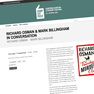
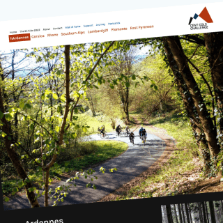
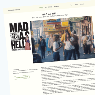
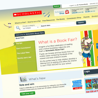
Experience building and project managing many sprawling content heavy sites with Craft CMS from being an early adopter. The ability to build powerful relationships between content has been a powerful feature planning content structures and clear build strategies to get the most from this powerful product.
HTML & CSS: Craft CMS, Hugo, Forestry, Tailwind CSS
Email: Email template designs